Prototype
2 hours Speedy Sunday Sprint
Reading time:
3 minutes

The Spark
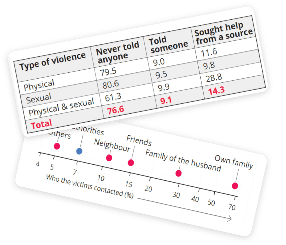
It started when I was reading an editorial by The Hindu

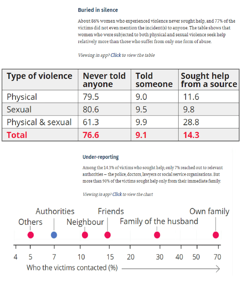
While the data wants to tell us an important and grim story, there are a lot of problems with the current visualization-
• This is a very linear way of giving information, unsuitable for correlations
•The narrative could've been better, more engaging
• The percentage is misleading, doesn't clearly give the clear picture
• The seriousness of the data is not shown properly
Redesigning the Viz

I have combined the two sections of the story mentioned above since they are attributes of the same dataset. Moreover, to give a better impact and idea to the users, combining these two would put things into perspective.
Both the datasets were combined to give a better reference to the number for a larger impact on the audience It would be an assumption to rate the source women seek help from, so in this iteration, I've divided the sources into just two parts- authorities (green) and non-authorities
The division is done according to the area instead of blocks to get an accurate division and the pixel width equivalent to one woman is shown to give more perspective to the largeness of the number. Moreover, Colors were used to interpret the different sections.
Real-life numbers are shown to give the audience a better idea. Area wise distribution of data is used for clearer comparison. The percentage value of the women who sought help are calculated according to the previous dataset to reduce the confusion
The Visualization
