Internship Experience at Honeywell
Timeline
2 months
Keywords
UX research, Data Visualization, UI
Type of Project
UX Internship
Sponsor
Honeywell
Some details modified due to NDA
TLDR;
I designed a data visualization approach for plant engineers. This enabled engineers to quickly access and interpret millions of data points, significantly accelerating the process of deriving actionable insights and reducing decision-making time.
Reading time:
6 minutes
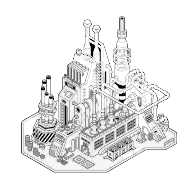
glimpse inside a plant
A tense environment, alarms blaring. A plant engineer, along with on-site staff tries to identify what is causing the fault in the functioning, hidden within millions of sensors and actuators, building the plant.
Instead, his head is buried in tables full of data, trying to make a decision.
The Problem
Buried in the data chase
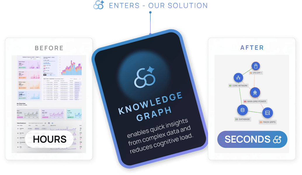
Plant engineers and on-site staff access real-time data of millions of sensors and actuators to keep operations running smoothly. However, even a minor sensor failure can cascade, disrupting entire plant segments and taking hours or days to diagnose.
research & discovery
Who's this for
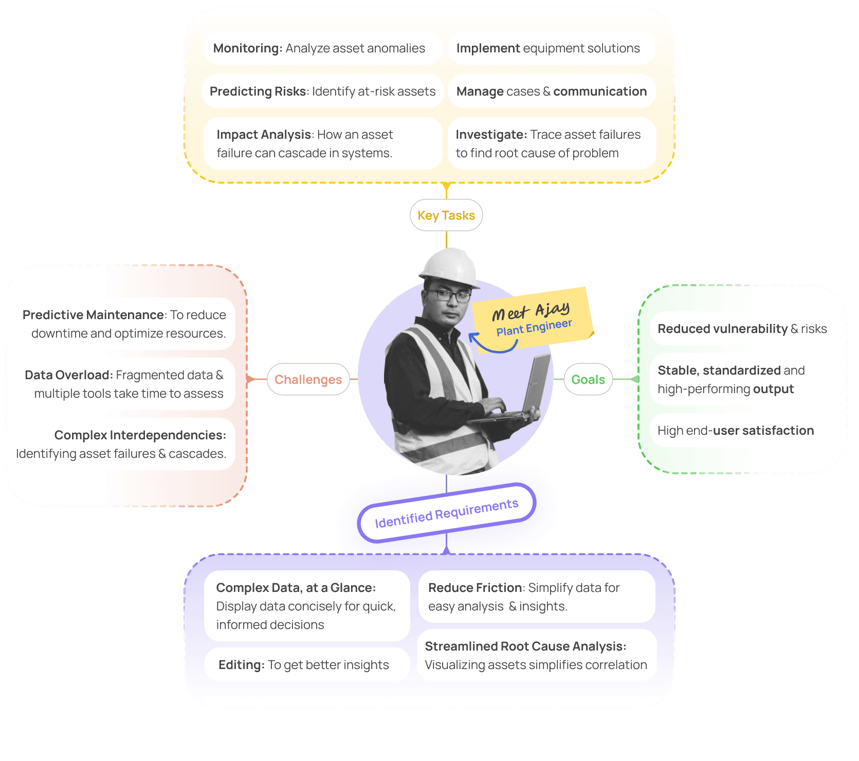
Plant engineers manage daily operations, from planning to troubleshooting, ensuring smooth, secure, and high-performance plant functionality. They tackle outdated documentation, fragmented data, and handle security alerts and functional on-site needs.
solution
Knowledge Graphs
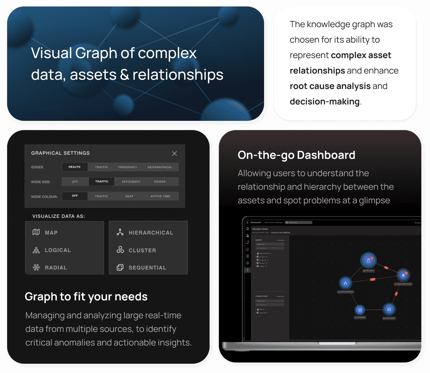
A dashboard paired with a data knowledge graph was developed to enhance root cause analysis, visually mapping asset interconnections and streamlining data insights for quicker issue resolution.
dissection
What makes the Graph
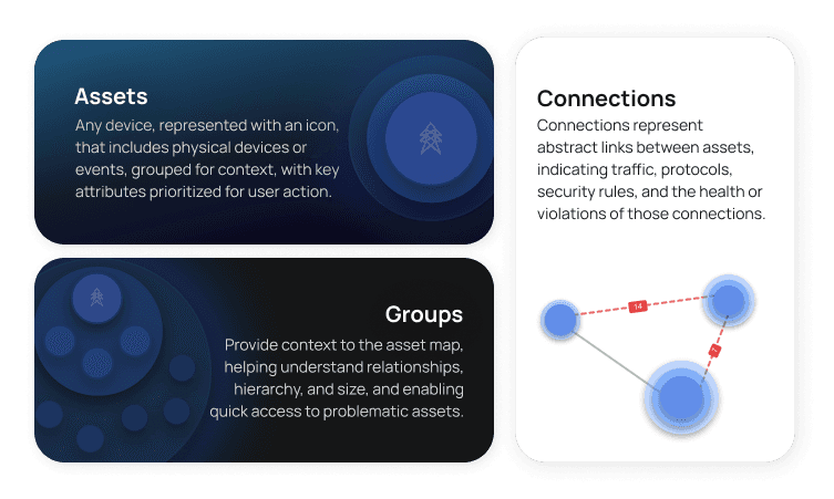
These Knowledge graphs are composed of 3 major components- Assests, connections and groups.
in depth
Solution Overview
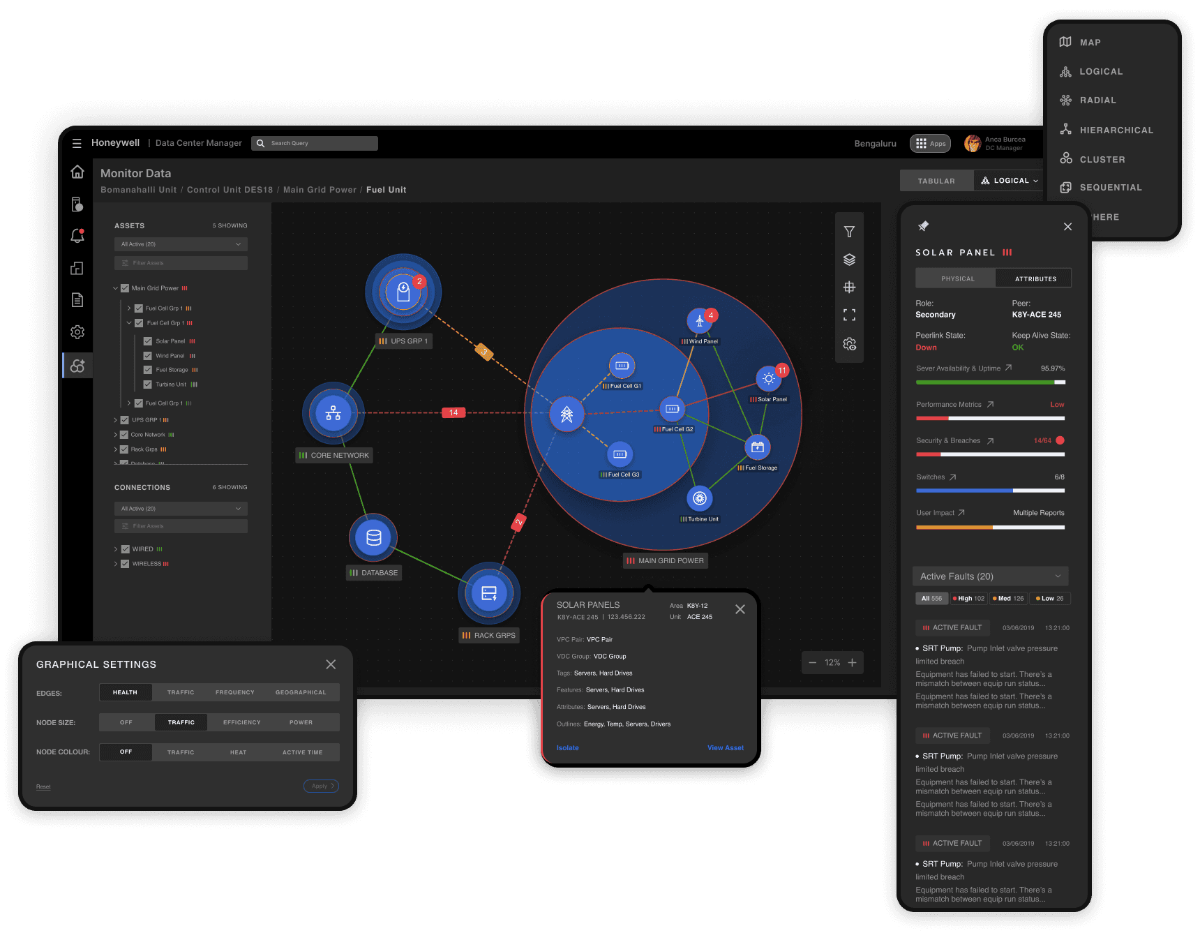
Integrated into the existing dashboard, the new section introduces context-based visualizations, allowing plant engineers to interpret data visually alongside their existing numerical displays.
use cases
01.
Zooming in, Zooming Out
Show me what’s vital
Users monitor high-level alerts with asset health indicators for severity, status, and context-specific events, quickly pinpointing issues on map.
Drill down the Hierarchy
Users explore the network to identify anomalies and, when focusing on an asset, utilize tools like tooltips, graphs, and layers (LHS) for comprehensive insights quicker
02.
Web of Impact
Asset Profile
Clicking on an asset opens a modal with key info—name, type, attributes, location—and a link to the asset page, along with quick actions like grouping and tagging.
Analyze Impact
In this mode, users can focus on specific events or alerts by isolating affected assets and their connections, filtering out irrelevant noise for clearer investigation.
03.
Data to Insights
Adaptive Node Sizing
Automatically adjusts node sizes based on asset activity or importance, helping plant engineers instantly identify high-traffic or high-priority assets.
Condition Color Mapping
Uses color to indicate asset status—such as health, connectivity, and load—enabling quick identification of critical issues across the network map.
BTS (Confidential content hidden)
